Progetto realizzato per l'esame di Progettazione Grafica I.
Data la serie di conferenze dell'AIAP (Associazione italiana design della comunicazione visiva) "Circonferenze 2030" era richiesto di realizzare due proposte grafiche, per le quali presentare il manifesto del calendario generale degli eventi e i manifesti distinti per tre delle nove conferenze.
Il tema fulcro del ciclo conferenziale è la rilevanza della figura del designer e del progettista nei confronti della realizzazione dell'agenda ONU delle 5P, che attraverso l'impegno degli stati delle Nazioni Unite prevede il miglioramento delle condizioni di vita a livello globale, entro il 2030, in cinque macro temi:
Persone, Prosperità, Pace, Partnership, Pianeta.
ENG
Project realized for Graphic Design I exam.
Given the series of AIAP's conferences (Italian Association of Visual Communication Design) "Circonferenze 2030" it was required to create two graphic proposals, for which to present the poster of the general calendar and the posters for three of the nine conferences.
The main theme of the conferences was the centrality of the figure of the designer in relation to the ONU's 5P's agenda for the 2030, a program that through the effort of the United Nations members strive to achieve the bettering of the world in five macro areas:
People, Prosperity, Peace, Partnership, Planet.
Nella seguente proposta mi sono impegnato a ragionare sul contatto tra il design grafico e gli obiettivi dell’agenda ONU delle 5P, in modo da realizzare un’opera che riflettesse in modo efficace il tema della serie di eventi.
Ho voluto dunque ritrarre il parallelismo tra l’inquinamento del nostro pianeta e quella del mondo del visual design: Un inquinamento che non è tanto evidente ed esplicabile come quello materiale, ma che sorge dalle stesse cause: Mancanza di consapevolezza, negligenza e non curanza.
Un mondo che mira al progresso delle condizioni generali del pianeta e della nostra vita su di esso deve anche preoccuparsi che chiunque operi nel visual design si preoccupi dei propri messaggi, e che si consapevolizzi sul peso che ha la comunicazione visiva.
Un discorso che ha acquistato senso sopratutto, se non unicamente, grazie all’introduzione del primo Macintosh, che ha reso il “fare grafica“ un affare popolare, democratico e quotidiano.
Si è scelto dunque di accostare il suddetto con una fotografia dell’incidente di Chernobyl, in modo da denunciare quanto la comunicazione che produciamo sia impattante, e sfortunatamente molto spesso in modo negativo.
La scelta grafica si lega sia al tema della denuncia che alla popolarizzazione del graphic design, riprendendo dunque uno schema di colori a due toni, in riferimento allo stile della grafica Punk, uno dei primi stili di grafica "del popolo", spesso utilizzato per diffondere messaggi sovversivi o contro corrente.
Il carattere utilizzato per i titoli è Svang, che ho scelto di utilizzare in quanto molto moderno, allarmante e originale, e si lega esteticamente alla perfezione con il concept sviluppato per il logotitolo, che ritrae cinque (5P) sbarre angolate e alternate, tipiche della segnaletica di pericolo e allarme.
Il secondo carattere è Zodiak, un serif dalle forme molto aggraziate, che ho utilizzato in modo da creare un contrasto intrigante: Tra moderno e allarmante, e morbido e abituale
ENG
In the following proposal I tryed to focus on the similarities between graphic design and ONU's objectives, so that the result could match effectively the theme of the conferences.
I wanted to portray a parallelism between enviromental pollution and visual design pollution: the latter is not as visible and easily explainable as the first, but it is a consequence of the same causes: lack of sensibleness, negligence and carelessness
as we strive to better humanity's living condition in our planet, we shall not overlook the the importance of approaching the matter of designing with carefullness and awarness, as both visual and non visual communication have always had a great impact on our society.
This matter is much more relevant now than it ever was, as designing became something that anyone with a computer can do, and anyone with access to the internet can share with others.
This democratisation is the result of a process that began in 1984, with the release of Apple's first Macintosh.
Given its meaning, I then chose to combine the machine with a photograph from Chernobyl's accident, implying how large scale communication can have a great impact, and in numerous case of the bad kind.
Graphically speaking I've been inspired by the Punk aestethic, as it is one of the first graphic design trend that was accessibile by all and was often used for rebellius and counter-corrent communication. This choice also reflect the general motifs, wich are of denounce and democratisation. In order to achieve the aforementioned look I opted for a duotone palette.
The typeface chosen for the titles is Svang, as it is very modern looking and original, and it matches perfectly the concpept developed for the logotitle, wich portrays five (5P's) diagonal lines, referencing to the iconic aestethic of danger or warning signs.
The other typeface I employed is Zodiak, a very delicate and graceful serif that creates an intriguing contrast: a strange relationship between modern and allarming, and comforting and abitual


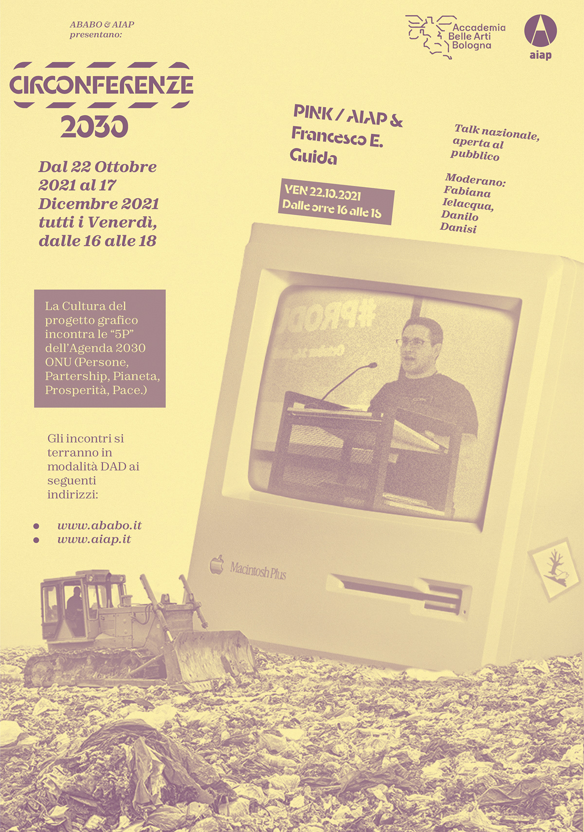
Per quanto riguarda i singoli manifesti, ho deciso di declinare la grafica principale ponendo attraverso la fotocomposizione il design, rappresentato dal Macintosh, in altri contesti che riguardano il programma delle 5P, ponendo in maggior rilievo il tema del dialogo tra la progettualità e l’agenda.
Per l’impaginazione ho deciso di prediligere un approccio lineare e chiaro per il calendario generale, in modo da favorire una lettura diretta e agevolata, mentre nei manifesti dei singoli eventi ho cercato di legare le tensioni spaziali delle immagini con quelle del testo.
ENG
Regarding the posters for the single events, I decided to operate by putting the design, symbolised by the Macintosh, in scenerarios that represents major problems that humanity is facing. This was done in order to highlight the centrality of the designer in the contexts of ONU's 5P agenda.
The text layout in the general calendar was designed with the objective of being as easily readable as possibile, while the other posters tend to be more dynamic, following and responding to the spatial tensions of the photos.